PetNZ - order history and dog food search (Case Study)
Proposing a seamless design solution for better customer/ user experience for accessing order history and dog food search filter process.
Website design | UX/UI | Group Project
Challenge & Objective
Current system in place for ordering via PetNZ is not integrated properly. The overflow and disorganized information on the website is adding more frustration to the regular clients or users/ customers. PetNZ is also looking into increasing their sales for Dog Food.
With pandemic and lockdowns, the need of online sales have increased. Where users are more inclined towards hybrid system. Given the demand, an automated, simplified design is required for Customer Accounts on PetNZ where it can cater current clients’ needs and help increase sales for the company as well.

Methodology
The User

Problem Statement
Understanding the needs of regular customers and keeping in mind of any potential clients/ users landing on PetNz website, a smooth, accessible design is required. Where information flow is rightly placed and distributed with targeted up-selling and cross-selling especially for Dog food as PetNZ is keen to increase the sales for it.
An easy, less clickable system is required where customers can access their onsite and online purchasing history in one go.

Process

To understand the user and their needs, we took the journey step by step to identify pain points and which part of the journey is to be focused on.
It came out evidence that the user was frustrated in navigating their account and site for the dog food search.
We decided to focus on these two issues primarily.
After walking the user’s path, we decided to focus on two user flows and merged them into one: search filters and account dashboard.
Meaning, that when the user lands on the website, they are able to navigate the website easily, mainly through the search filter. At the same time, they can log in to their account, to access order history. A user should also be able to search for other options for dog food and not just from their regular purchases.

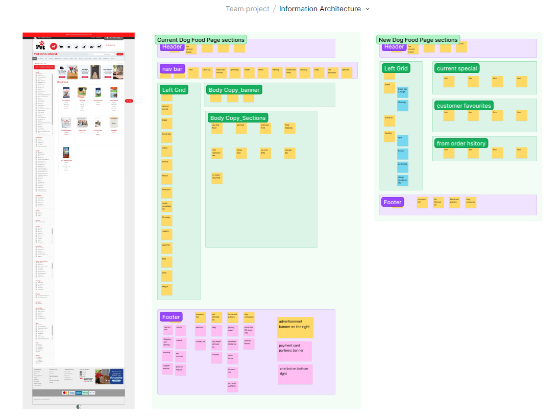
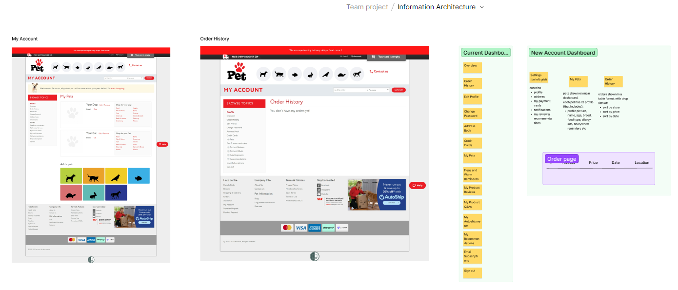
Information Architecture
One of the biggest challenege was to understand the information architecture of the current website in place. We knew it at this point how important this step was in the process. If done right, it will be much easier to design a comprehensive UI later.

We decided to focus on the following content as per the requirements of PetNZ. Where we worked side by side on Figjam, listing down what we have in place and how we can sort and divide the infromation.
We started off with simplifying Header and Footer with removing “sectional bar” from the top and bringing it to the end, adding two more levels on the Navigation bar. We also added sections of interest. For dog food search page, we shorten the groups for filters to make it easy for the customers to filter information as they require.
We added “recent order history” and “pet information” while taking profile information in the left grid on main account dashboard.
We made sure to keep the essence of the brand, simplifying current structure by keeping same content.


Sketches (crazy8s)
We focused on doing crazy8s for main Home page as it is the benchmark for styling any website. Me and my team colleague did our own versions and then picked out the mix of best version from our sketches.


Wireframes

Styleguide


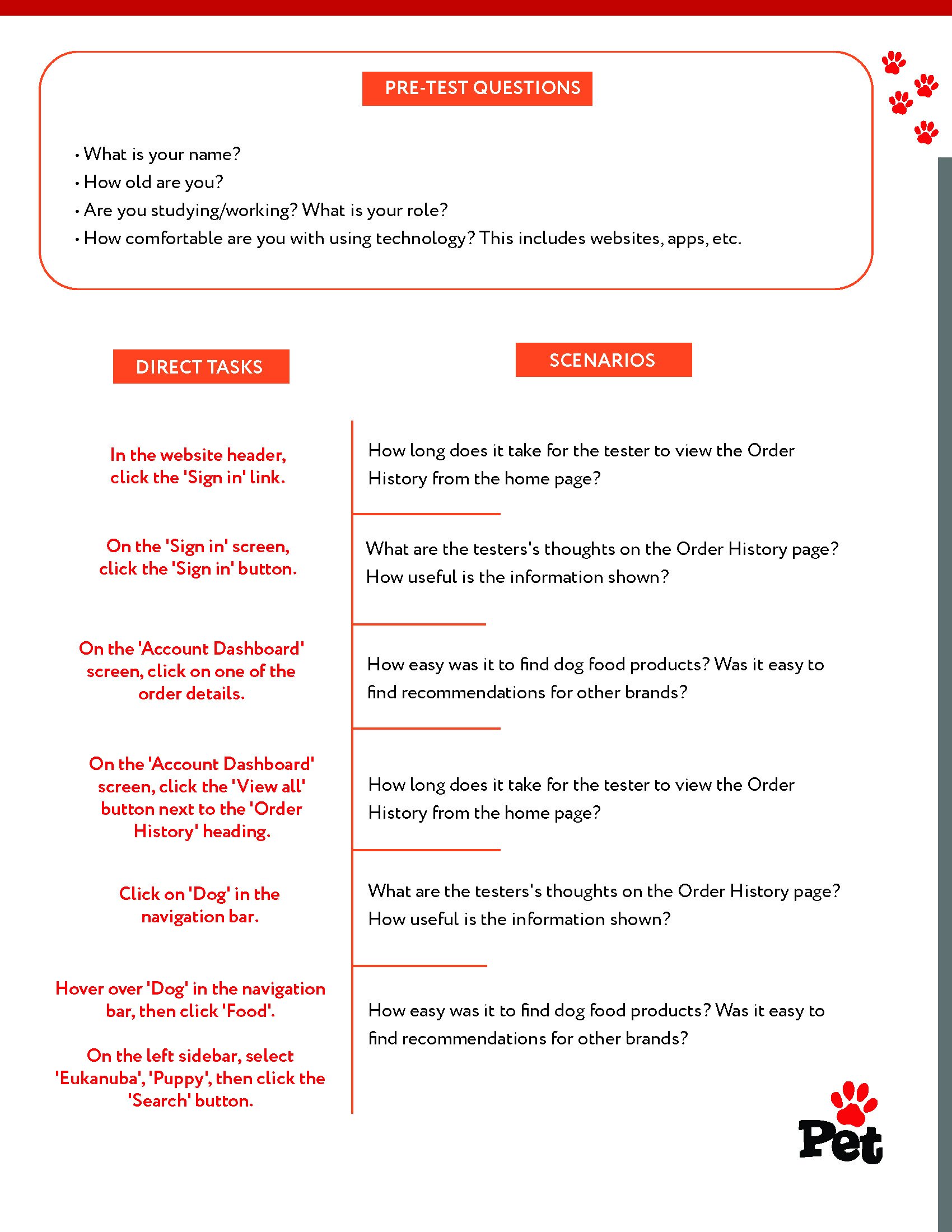
User Testing Plan
Our next step is to carry this hi-fidelity prototype for live user testing. Where our focus will be to determine how users navigate the account dashboard and use dog food filter and what is the scale of usability and accessibility.